
It seems like a simple thing. Have the text align to the bottom of an element, instead of the top, while filling it’s parent’s container. In practice, it is a lot harder than it should be.
Why would you want to do this in the first place? My reason is so that the text would sit just above the drop-down menus, and as more lines are added the text moves farther up into the container. In my design, the menu bar is a fixed height that is attached to the top of the page. By default the template that I am using has the menu items padded so that they occupy the middle of the navigation bar. If all of the text in the menu has two lines, it doesn’t look that bad.
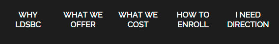
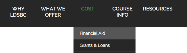
Once there is a mix of one and two lined menu items, then the top padded nature of the menu item becomes more evident. However, it still doesn’t look too bad.

Add drop-downs to the mix, then the one line menu items can loose their association with their drop-down because of the overwhelming dark color.
I wanted to bring the text down so they sit at the bottom of the container, with additional lines of text being added above this baseline. This would make the text sit just above their respective drop-down, making the visual connection between the menu item and the drop-down more obvious.
During my research, I found that one widely used method is to make each menu item absolutely positioned to the bottom of the list item. So I tried it. It sounded good on ‘paper’, but in practice I ran into a couple of issues.
The biggest issue was with the text falling off the bottom of the menu bar on multi lined menu items. If the text was positioned so that the bottom of of the multi lined menu items where at the bottom of the navigation bar, then the single lined items again had a bit of space between them and the bottom.
Another issue is that positioning the item took it out of the page’s flow. When the text got to wide, it overflowed the container, and ran over other menu item’s text to its right, thus breaking the layout and making the menu item illegible. I decided to find a different method.
The Code
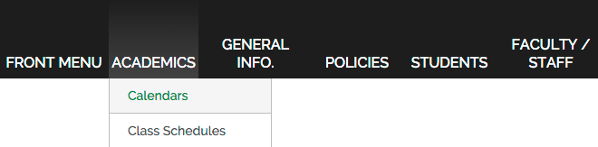
The menu items in the images above are made up of an unordered list. Each drop-down is it’s own unordered list and is a child of the menu item above it.
Here is the HTML:
<nav id="topMenu" class="aMenu">
    <ul class="theMenu level0">
        <li class="mainMenuItem first"><a href="#" class="mainMenuLink  first haschild">Front Menu</a></li>
        <li class="mainMenuItem separator haschild"><span class="mainMenuSeparator  haschild">Academics</span>
            <ul class="level1">
                <li class="subMainMenuItem first"><a href="#" class="mainMenuLink  first">Calendars</a></li>
                <li class="subMainMenuItem"><a href="#" class="mainMenuLink">Class Schedules</a></li>
                <li class="subMainMenuItem"><a href="#" class="mainMenuLink">Course Descriptions</a></li>
                <li class="subMainMenuItem"><a href="#" target="_blank" class="mainMenuLink">MySchool</a></li>
                <li class="subMainMenuItem last"><a href="#" class="mainMenuLink  last">Transcripts</a></li>
            </ul>
        </li>
        <li class="mainMenuItem separator haschild"><span class="mainMenuSeparator  haschild"">General Info.</span>
            <ul class="level1">
                <li class="subMainMenuItem first"><a href="#" class="mainMenuLink  first">Accreditation</a></li>
                <li class="subMainMenuItem"><a href="#" class="mainMenuLink">Address / Directions</a></li>
                <li class="subMainMenuItem last"><a href="#" class="mainMenuLink last">Board of Trustees</a></li>
            </ul>
        </li>
        <li class="mainMenuItem"><a href="#" class="mainMenuLink">Policies</a></li>
        <li class="mainMenuItem"><a href="#" class="mainMenuLink">Students</a></li>
        <li class="mainMenuItem last"><a href="#" class="mainMenuLink last">Faculty / Staff</a></li>
    </ul>
</nav>
And here is the CSS:
nav ul {
  list-style: none;
}
.aMenu {
  display: block;
  height: 90px;
  margin: 0;
  position: relative;
  text-align: center;
}
.aMenu > .theMenu {
  display: inline-block;
  margin: 0;
  padding: 0;
}
.mainMenuItem {
  font-size: 16px;
  font-weight: 500;
  height: 90px;
  text-transform: uppercase;
  margin: 0 2px;
  padding: 0 3px;
  text-align: center;
  clear: none;
  float: left;
  position: relative;
}
.mainMenuItem:hover,
.mainMenuItem:focus {
  background-image: linear-gradient(#222222, #444444);
}
.mainMenuItem > .mainMenuLink,
.mainMenuItem > .mainMenuSeparator,
.mainMenuItem > .mainMenuHeading {
  color: white;
  display: table-cell;
  height: 83px;
  line-height: 1.3;
  padding-bottom: 7px;
  min-width: 5.75em;
  max-width: 7em;
  vertical-align: bottom;
  transition: all 0.3s ease-out;
}
.level1 { display: none; }
Why This Works
The reason this works is that the menu bar has a fixed height (height: 90px;). Thus we are able to assign a fixed height of 90px to .mainMenuItem.
The magic sauce is in the rule declaration for .mainMenuItem > .mainMenuLink, .mainMenuItem > .mainMenuSeparator, .mainMenuItem > .mainMenuHeading. We set display: table-cell; and gave it a height of 83px so we can use vertical-align: bottom;. The padding-bottom lifts the text just off the bottom of the navigation bar for a nicer look. I wanted the text to remain centered in the menu items, but to have some flexibility in the overall width, so I set a min-width and max-width as well.
A word of caution. The height of the menu item, plus any padding can’t exceed the height of the list item, or it will cause the menu item to overflow downward. This is why the menu item’s height is set at 83px although the height of the list item is at 90px.